
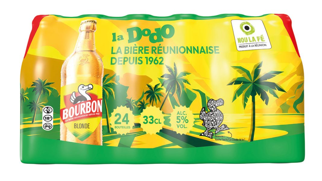

The graphic universe of the Dodo label has not evolved since 2015. It is modernized and embellished in order to revive the historical link uniting Reunion beer and its consumers..
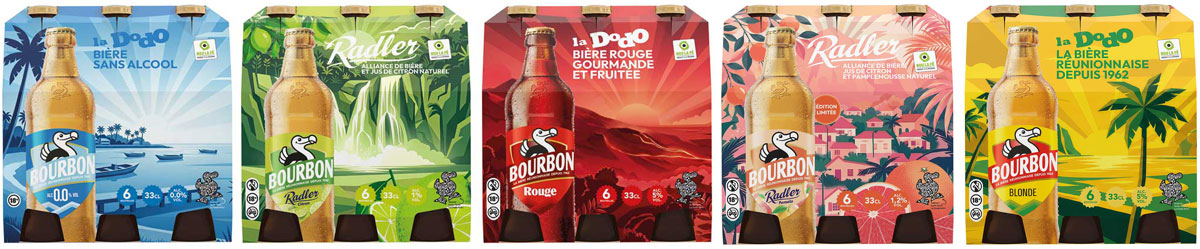
Something was brewing : we felt it recently during the Brasseries de Bourbon campaign which revisited in particular the famous slogan of the brand (“Adopted since 1962”). She seemed to be winking at us, signaling change.. We have confirmation. New label, new decorations on the packs, new visuals: the promotion of Dodo is accompanied by a change in visual identity encompassing the entire range and equipment of out-of-home services (glasses, chairs, tables et parasols). The world of the dodo symbol is modernized on classic beer in its different formats of 6, 12, 20 and 24 units. Also on the Red Dodo, on non-alcoholic beer and the entire Dodo Radler family. A family that has just gained a new reference : the Radler Grapefruit, launched in September. The next new thing, la Radler Letchi, will also sport the new colors in December.
An aesthetic in the era of time
The aesthetics of products is a marketing issue and consumers are sensitive to it. They want to buy products that fit their world, who look like them. Too, without changing anything in its recipes, the Brasseries de Bourbon decided that it was time to update what Dodo represents for today’s Reunion Islanders. The visual story is renewed, rejuvenates and diversifies into more expressive lines and brighter colors. The time has come for change in continuity : the bottle label takes the shape of its famous coat of arms. To stand out more on the shelves, the packs are decorated with emblematic landscapes of the island. The Barachois on the Dodo packs. The volcano on the Rouge. The beach of the Pirogue basin on the beer 0.0%. Or the Niagara waterfall on the Radler Citron, the cirques on the Radler Pomelo and the Sainte-Suzanne lighthouse on the future Radler Letchi.
A unique signature on all ranges
Another significant development : the same revisited logo will appear on all products (previously, it was available in several variants depending on the range). With one exception : on service equipment deployed externally, it surrounds itself with a circle of rays. A very clear symbol of radiation. Bourbon Brand Manager, Anne-Gaëlle Catiando explains : “The visual identity of our labels needed renewal. With time, the link with consumers had weakened a little. Studies showed. These are the consumers who wanted to see something new in terms of image. With this new graphic charter, Dodo gets closer to its consumers while opening a new page in its history. »